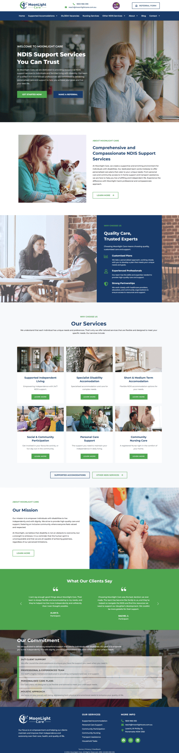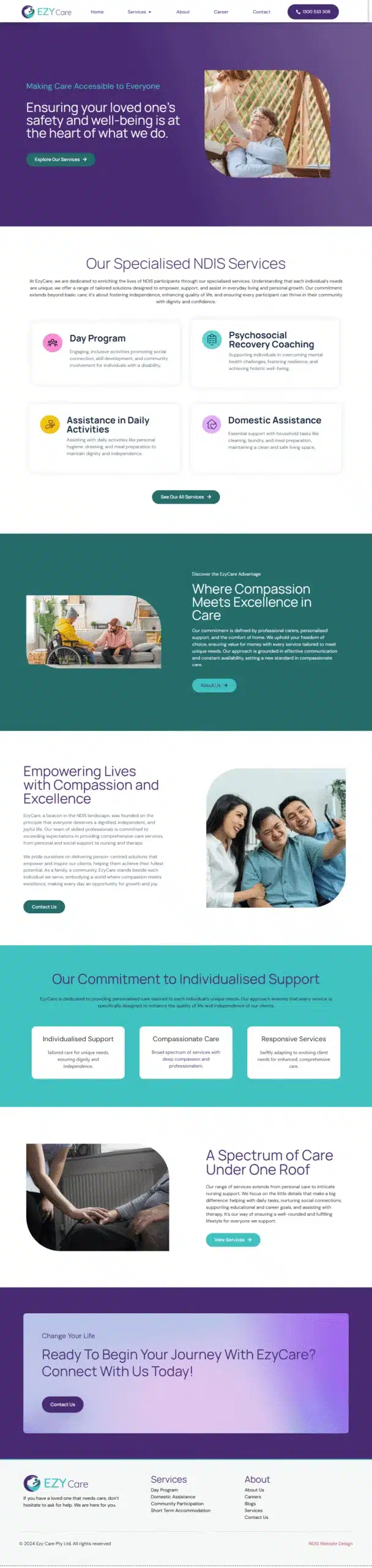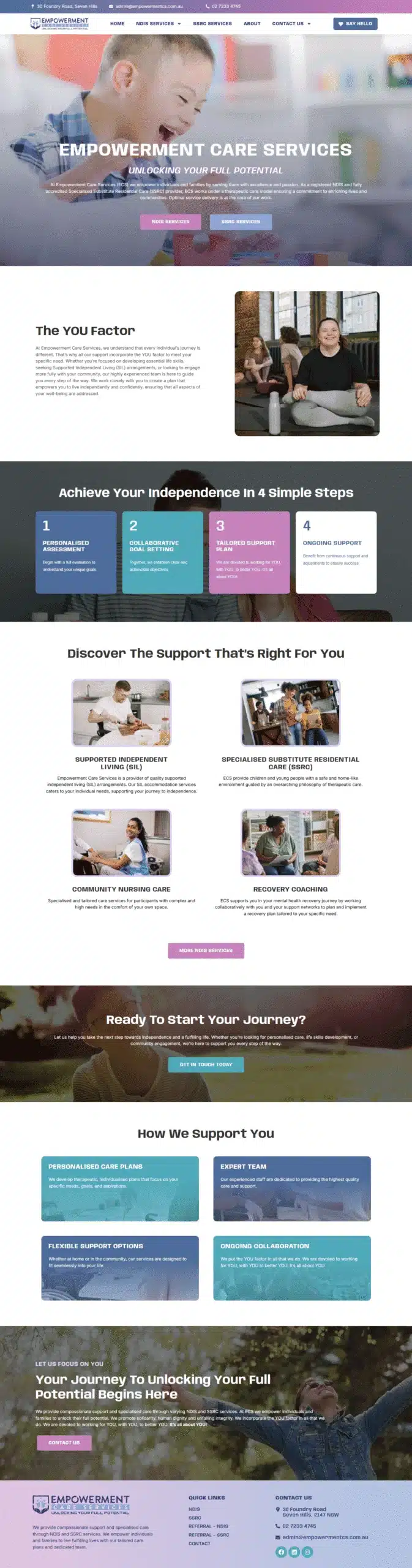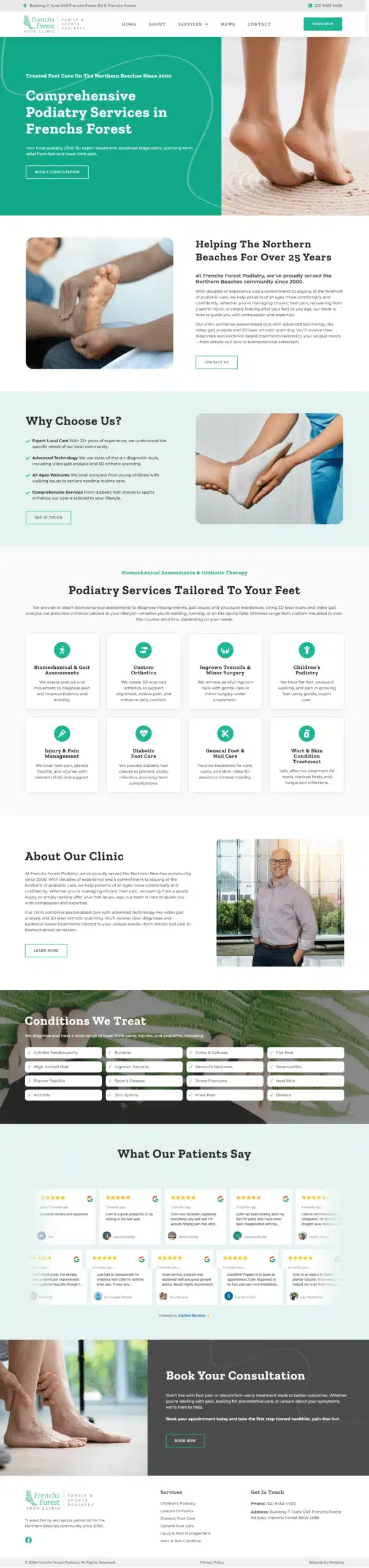

Design for NDIS and aged care
Many providers offer both. We plan content pathways for each audience so older Australians and people with disability find the right information without confusion.
Home › Services › NDIS website design
Modern, compliant and accessible websites that help NDIS providers communicate clearly, generate more enquiries and build trust with participants and referrers.
I recently worked with Julian and the team at MindSite Web Services. Julian made the process so enjoyable, he was so responsive to my needs and communicated thoroughly through the entire process. I would highly recommend MindSite!
– Sarah Jenkins
Why choose us
We combine strategy led design, content and SEO to create a platform that works as an intake engine rather than a brochure. A provider website has to be simple to navigate, readable, and inclusive for all abilities.
Your site should make it easy for participants and support coordinators to find services, check eligibility and contact your team. Thoughtful information architecture, accessible colour contrast and WCAG aligned interactions do the heavy lifting.
Get started →
Built for participants and coordinators
Two audiences, two paths. Services, eligibility and contact points structured so neither has to guess where to go.
Accessible from the outset
Clear headings, keyboard navigation, descriptive links, transcripts and alt text, because inclusion is the point rather than a checkbox.
Referral and enquiry forms wired in
Referral forms, live chat, bookings, maps and secure document uploads integrated to streamline intake.
Supports the audit conversation
Policies, processes and quality information presented clearly, so the site plays its part in how your organisation is assessed.
What is included
Strategy workshops, sitemap and wireframes, customised design, copywriting guidance and build.
Many providers offer both. We plan content pathways for each audience so older Australians and people with disability find the right information without confusion.

Clear headings, keyboard navigation, descriptive links, transcripts and alt text from the outset, making content easier to consume and showing your commitment to inclusion.

Referral and enquiry forms, live chat, bookings, maps and secure document uploads, integrated to streamline the way work actually reaches you.

Keyword research, metadata, schema, internal linking and page speed, so families and coordinators find you when they search rather than a competitor.
Websites are only one part of compliance, but they play a role in presenting policies, processes and quality information clearly and consistently.

Content creation, SEO growth programmes, review generation and email campaigns that keep the pipeline active once the site is live.
How it runs
Clear stages, so you can plan around staff and participant commitments.
We start with a goal driven strategy built around your supports, your participants and the referrers you want sending work your way.
We build a clear, SEO optimised sitemap that structures services, eligibility and resources so people reach the right page first time.
Visually striking, responsive websites with accessibility designed in rather than retrofitted after a review flags it.
We do not launch and leave. Support continues so the site keeps working while your team gets on with delivering supports.
Once the site is live we help you grow, putting your services in front of families and coordinators already searching for them.
Your organisation evolves and the site should keep pace, adding supports, locations and resources without starting again.
Selected work
From community access and allied health through to supported independent living. Hover over one to scroll through the page.
Our difference
Plenty of provider sites look friendly and still leave coordinators hunting for a referral form.
What you get
With MindSite
Typical provider site
Audiences
Separate paths for participants, families and coordinators
One page written for everyone and landing with no one
Accessibility
Designed in from the outset, not audited in afterwards
Low contrast text and images with no alt text
Referrals
Referral forms and secure uploads wired into the page
An email address and a downloadable form
Eligibility
Answered up front so people self qualify before contacting you
Left vague, so your team fields the same call repeatedly
Being found
Keyword research, schema, internal linking and local pages
Invisible for the supports and suburbs you actually serve
Editing
Your office updates bios, news and resources without us
Every small change becomes a developer request
Under the hood
The parts participants never notice, and the reasons the referrals arrive.
Participants and coordinators are checking whether you can take them, in their area, with their funding. Answer that on the page and the enquiries you receive are the ones you can actually accept, which saves your intake team hours every week.
This is the one sector where a share of your visitors genuinely rely on keyboard navigation, screen readers, transcripts and colour contrast. Designing for it from the outset is both the right call and a visible signal of how your organisation operates.
A support coordinator scanning for capacity and a family reading carefully for reassurance need different things from the same page. Planning distinct pathways for each is what separates a site that converts from one that simply exists.
Keyword research, metadata, schema, internal linking and page speed put you in front of families and coordinators searching for a specific support in a specific area, which is how most provider searches are actually phrased.
Where a project lands depends on scope: the number of service pages, integrations like referral forms and document uploads, how much of the content we write, and features such as portals, resource hubs or multi location pages. We scope it with you first and quote a fixed price, so you know the number before anything starts. Ongoing care plans run from $250 a month.
Reviews
Real reviews from business owners across Sydney and Australia wide. Every one of them is verified and public, read as many as you like.
★★★★★
from 100+ verified Google reviews
Straight answers
What service managers ask us before committing to a build.
Typical builds take four to eight weeks depending on pages, integrations and approvals. We work in clear stages, strategy, design, build and launch, so you can plan around staff and participant commitments.
We can draft or guide content including service descriptions, eligibility and frequently asked questions. If you prefer, we provide templates your team completes and then we edit for clarity and accessibility.
Yes. We use familiar tools and provide handover training. Most updates such as team bios, news and resources can be handled by your office without technical help.
Yes. Many providers offer both NDIS and aged care supports, so we plan separate content pathways for each audience to avoid confusion between them.
Yes. Referral and enquiry forms, live chat, bookings, maps and secure document uploads are all part of what we integrate to streamline intake.
Websites are only one part of compliance, but they play a role in presenting policies, processes and quality information clearly. We structure that content so it is easy to point to.
NDIS websites start at $1,000. Where it lands depends on scope, including service pages, integrations, content support and features such as portals, resource hubs or multi location pages. We scope it with you and quote a fixed price before work starts, and ongoing care plans run from $250 a month. Most small business sites start at $1,500, and larger sites with custom functionality are quoted after scoping.
We provide ongoing care plans, content production and support. Once the site is live we help you grow it with SEO, review generation and email campaigns that keep the pipeline active.
Not the NDIS logo itself. That is a registered trade mark and using it needs written consent from the NDIA. Registered providers can use the "I heart NDIS" or "I support NDIS" logo with the "Registered Provider" tagline, downloaded from the NDIA and used to its conditions. Unregistered providers cannot use those either. The guidelines change, so we check the NDIA's current rules before putting any badge on your site.
WCAG 2.1 Level AA is the benchmark to build to. In practice that means proper colour contrast, keyboard navigation, real headings, alt text, and forms that work with a screen reader. We build to it as standard rather than as an add-on, because your audience is the reason it exists.
If you want participants and coordinators to find you, yes. Most people looking for a provider never scroll past the first few results, and they search locally. The structural work ships with every build. Competing for the harder terms is ongoing work we quote separately.
Both. A redesign is the riskier one, because it is easy to lose whatever rankings the old site earned. We map what is already working, keep the URLs, and redirect properly so the traffic comes with you.
It helps if the site answers what a coordinator or family actually needs: what you do, where you cover, whether you have capacity, and how to refer someone without phoning. Most provider sites bury all four. Nobody can promise you referrals, but a site that answers those questions converts far better than one that does not.
Yes. We do graphic design alongside the web work, so brochures, service flyers and referral forms match the site instead of looking like they came from somewhere else.
Three quick steps, under a minute. We come back to you with straight answers, clear pricing and a plan you can keep whether you go ahead or not.
Send us your provider site. We will check it for accessibility barriers, trace how long it takes to find eligibility and a referral form, and send you a plain English summary of what is costing you intake.
Rated 5.0 from 100+ Google reviews. No lock in contracts, ever.